An approach to accessible digital map experiences
Research article  Open access |
Available online on: 05 October, 2020 |
Last update: 28 February, 2022
Open access |
Available online on: 05 October, 2020 |
Last update: 28 February, 2022
As a former cartographer, and now an accessibility and user experience consultant, I’ve always been interested in the topic of accessible maps. This topic is also a challenge to many of our clients, who worry about the accessibility of the maps on their web sites and applications.
In a recent conversation, a client was considering removing the maps from their web site, which had been provided by a third-party. They were worried about legal action relating to inaccessibility, as they didn’t know what sort of accessibility problems were present and were concerned they wouldn’t be able to fix any problems that did exist.
 Indeed, maps can seem to be a significant accessibility challenge, given that they are a complex visual presentation of information. But as a map lover who recognizes the value that maps can bring people with disabilities, I don’t want organizations to remove maps from their web site because of concerns over accessibility.
Instead, let’s consider how can we apply a sensible strategy to deal with map inaccessibility in a way that benefits everyone. The way to do that is to focus on the experience provided by the map.
The purpose of maps
The power of a map is that it uses spatial relationships to present data, often giving it new meaning. Interactive digital maps have brought some capabilities that paper maps can’t provide, including the ability to turn on and off different layers of a map, show different levels of detail when zooming in or out, and show changes over time.
Additionally, with GPS-enabled mobile devices, there are new opportunities to provide location-based interactions with digital maps. Digital maps are easier to update than paper, so can more quickly reflect important changes, such as new highways or renamed buildings. Even mountains change—in my first summer as a cartographer, I had to change the height of Aoraki/Mount Cook in New Zealand, after its height dropped by ten metres due to a landslide!
Let’s think about some common uses of maps that you might find online:
- A street map that identifies the location of a company’s head office, along with key local landmarks
- A map that shows the legal boundaries of a property
- A map that presents data of an important health phenomenon, like numbers of cases of COVID-19 by country
In each case, a map is adding geographical meaning to some underlying data, helping people use that data to complete real-world tasks.
The essential components of an accessible map experience
A digital map experience can be accessible to people with disabilities when it meets these core requirements:
- The map’s controls are meaningfully labelled, and they can be operated without needing to use a mouse.
- The map’s information is presented without relying on color perception.
- The map’s information is available in a nongraphical form.
(There are a number of additional, subtler requirements depending on the specific nature of the map. But if a map can satisfy these core requirements, it’s likely to be accessible.)
Making digital maps keyboard-operable should be straightforward when developers use standard controls to interact with the map and when they provide supplementary keyboard commands where necessary.
Providing a map that does not rely on color to communicate information might initially seem to be more challenging. But there are many cartographic techniques available to convey information in ways other than color, such as variations in shading patterns, line thicknesses, and typefaces.
For both requirements, a review against accessibility standards such as the W3C Web Content Accessibility Guidelines will help you understand how well a digital map meets these requirements. If you have the capacity to remediate any issues you find, the review will indicate what changes may be needed to optimize the map’s accessibility.
The third requirement, “the map’s information is available in a nongraphical form,” is the one that may seem most difficult, especially for visually complex and dynamic maps. For all but the simplest of static maps, there is no short text description that can convey the same information.
This is when thinking about comparable experiences is essential.
Comparable map experiences
The Inclusive Design Principle of Comparable Experience [https://inclusivedesignprinciples.org/#provide-comparable-experience] says:
“Ensure (y)our interface provides a comparable experience for all so people can accomplish tasks in a way that suits their needs without undermining the quality of the content.”
This principle recognizes that alternative equivalent experiences may be justifiable when a single experience can’t be made universally accessible. Removing a visually complex map is not the answer to our accessibility problem.
So instead, let’s go back to considering the map’s purpose. Who is it provided for, and what tasks is it intended to support? What other ways could someone access the map’s underlying data in a nonvisual but meaningful way? Answer those questions as accurately and as carefully as possible. These answers will help you identify a strategy to ensure that as many people as possible can use the map through an additional means that’s comparable and equivalent.
Let’s return to the map examples from earlier. What tasks might they be supporting, and what additional ways can we support those tasks?
- The street map is there to help visitors find their way to the office. A comparable nonvisual experience might be a list of directions from key landmarks on the map, such as the nearest parking area or bus stop.
- The map showing the property boundaries may be there to complement a legal definition of the boundaries that’s already described in text. Providing a link to this definition could be a comparable nonvisual means of access.
- The map showing the incidences of COVID-19 infections is using data that could be presented in many different ways. A comparable nonvisual experience might be a table of the same data along with a search form that lets users filter the data to find data by region or country.
An effective strategy for map accessibility starts with understanding the digital map’s purpose and the tasks that it’s intended to support.
It recognizes that a single universally accessible map might be impossible to create, that in some situations there may be accessibility issues present that you are unable to address immediately, and that an equivalent means of access is an acceptable way to provide an accessible map.
It involves examining the map’s purpose and identifying comparable ways to provide access to the map’s information.
And when you can identify and provide those comparable ways, you’ll have made the map experience accessible.
Reference
- This article is adapted from an original post at: https://developer.paciellogroup.com/blog/2020/04/accessible-digital-map-experiences/
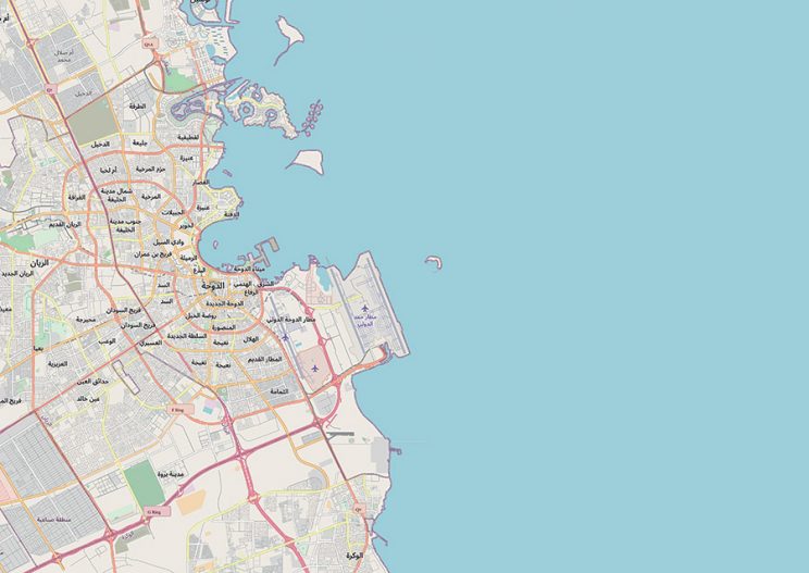
- The map is taken from “© OpenStreetMap contributors” —see https://www.openstreetmap.org/copyright for further details. To help with providing a text alternative for the article, the map shows the city of Doha, showing main highways, streets, city districts, the coastline, and the airport.